


Modern offices can feel like mazes — multiple floors, wings, meeting rooms, hot desks and shared hubs make navigation harder than it needs to be. Clear wayfinding signage solves that problem: it reduces stress for visitors and staff, reinforces safety and brand identity, and keeps people moving efficiently through the workplace.
What is wayfinding signage?
Wayfinding signage is part of environmental graphic design: a system of signs and visual cues that helps people understand and move through a physical space. In an office this ranges from big directional signs in lobbies to small plates on meeting-room doors — all working together to orient, inform and regulate behaviour. Effective Digital Signage and Wayfinding is both functional (easy to read, positioned at decision points) and aesthetically on-brand.
The four main types of office wayfinding signage
A simple, well-planned system typically uses four categories of signs — each serving a different purpose:
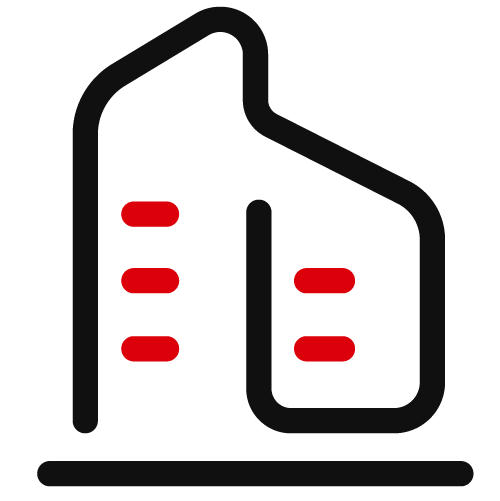
1. Directional signs
These are the navigational backbone: arrows, corridor signs, and directional pylons that point people toward departments, restrooms, elevators, exits and other destinations. Place them at entrances, junctions and other decision points; use concise labels and familiar icons so people can act quickly.
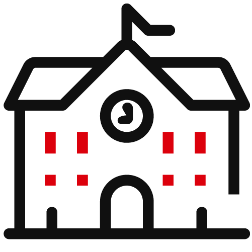
2. Informational signs
These provide context rather than directions — maps, floor directories, cafeteria or amenity details, Wi-Fi info, or emergency procedures. Informational signs are ideal in lobbies, lifts and common areas where people pause to look for more than just “which way.” Keep language simple, and pair text with icons for quick comprehension.
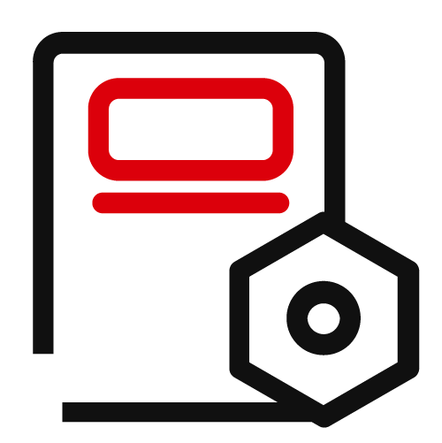
3. Identification signs
Identification signs label specific rooms and features: meeting rooms (often with names and capacities), departments, restrooms, print stations, and lockers. They help people confirm they’ve arrived at the right spot and can also surface useful metadata (e.g., “Room A — capacity 8 — video conferencing”). Mount them at eye level beside entrances for immediate recognition.
4. Regulatory signs
Regulatory signage enforces rules and safety: fire exits, no-smoking notices, restricted-area warnings, wet-floor alerts, and hygiene reminders. These signs follow stricter standards — high contrast, standard symbols and prominent placement so messages are unambiguous and legally compliant.
Visual elements that make signs work
The most functional signs are also thoughtfully designed. Key visual choices include:
-
Color: use high-contrast palettes and, when helpful, color-coding to differentiate floors or zones.
-
Symbols: universal pictograms (restroom, stairs, exit) speed comprehension across languages.
-
Typography: choose clean, legible typefaces and size hierarchy so the most important info reads at a glance.
-
Imagery & maps: large foyer maps, illustrated routes or murals can orient visitors quickly in complex or multi-tenant buildings.
A consistent visual language across the system both improves usability and strengthens brand identity.
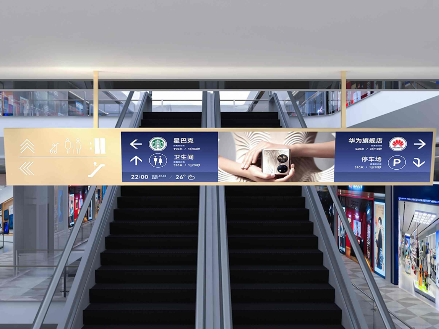
Trends: Digital Signage and Wayfinding
Wayfinding is moving beyond static boards. Emerging trends include:
-
Indoor mapping & smartphone integration: interactive maps and apps that guide people turn-by-turn inside buildings using Wi-Fi, Bluetooth beacons or triangulation.
-
Augmented reality (AR): overlaying directional arrows or labels on a phone camera view to give intuitive, visual guidance in real time.
-
Analytics: usage data from digital wayfinding tools helps facility teams identify choke points, optimize sign placement and measure the impact on visitor flow.
These technologies make navigation more personalised, accessible and measurable — but they also work best when combined with well-designed physical signage.
Practical takeaways for facility teams
-
Start with a user journey audit: map where people get lost and which decision points need signs.
-
Prioritise consistency: set a visual system (colors, fonts, icon set) and apply it across all sign types.
-
Balance digital and physical: use maps and apps for complex guidance, but keep clear, legible physical signs for immediacy and legal compliance.
-
Make accessibility non-negotiable: consider sightlines, font sizes, tactile/Braille options and multilingual needs.
-
Maintain and evaluate: replace worn signs, update regulatory notices promptly, and review analytics if you use digital wayfinding.
Good wayfinding is low-cost compared with the benefits: improved arrival experience, fewer interruptions for directions, stronger safety compliance and a workplace that feels intentional and welcoming. Implement a clear, brand-aligned signage system and your office will stop feeling like a maze — and start functioning like a well-oiled workplace.
FAQ – Digital Wayfinding Signs
1. What are digital wayfinding signs used for?
Digital wayfinding signs are used to guide visitors through complex spaces such as shopping malls, airports, hospitals, campuses, and office buildings. They help improve navigation efficiency and enhance visitor experience.
2. Can digital wayfinding signs be used outdoors as well as indoors?
Yes. These signs are available for both indoor and outdoor applications. Outdoor models are built with weatherproof and durable materials to withstand rain, dust, and varying temperatures.
3. How easy is it to update or change the information displayed?
The content on digital wayfinding signs can be updated quickly through centralized software. Facility managers can adjust maps, directions, or announcements in real time without manual replacement.
4. Do digital wayfinding signs support multiple languages?
Yes. They can display multilingual content, making them ideal for international environments such as airports, tourist attractions, and global corporate offices.
5. What kind of support and maintenance is provided after installation?
Customers receive full technical support, including training, troubleshooting, and ongoing maintenance services to ensure the signs operate smoothly and reliably over time.


 粤公网安备44030702001648号