

















From Visual Effect to Engineering Specification: How to Design, Specify, Fabricate, and Install Channel Letters That Perform
A channel letter can look convincing in a rendering and still perform poorly on the building.
A shallow return may reveal LED hotspots. A dark, textured façade can swallow a halo. A concealed power supply may keep the elevation clean while turning routine service into a costly access operation.
These are rarely isolated product defects. More often, they indicate that appearance, fabrication, installation, and maintenance were considered separately.
For architects, contractors, procurement teams, and brand implementation teams, specifying channel letters means connecting those decisions before fabrication begins.
Quick Answer
Channel letters are individually fabricated three-dimensional letters or symbols, made as illuminated or non-illuminated units. The familiar categories—front-lit, halo-lit, front-and-halo-lit, and non-illuminated—describe where light appears, but they do not define a complete specification.
The right construction depends on viewing distance, character geometry, façade colour and texture, environmental exposure, mounting access, electrical routing, and future servicing. The lighting effect should be selected after these conditions are understood.
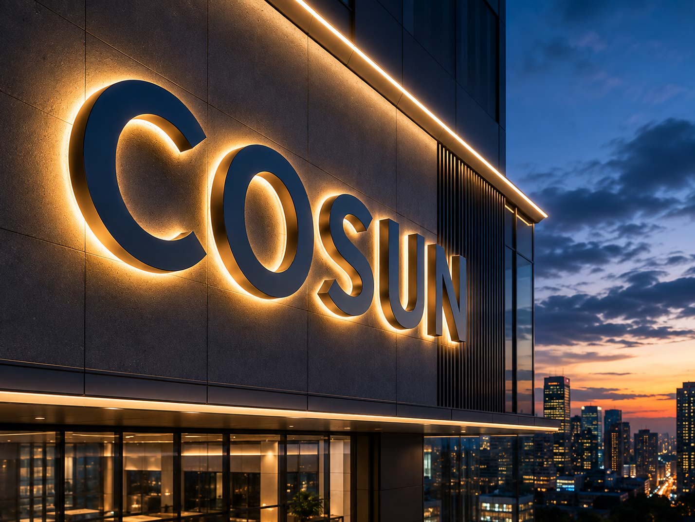
What a Channel Letter Actually Includes
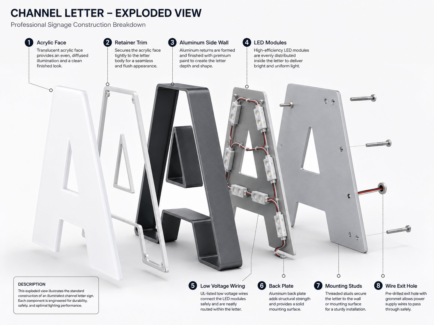
Most channel letters combine a face or front surface, side returns, a back, mounting components, and, when illuminated, LED modules, wiring, and power supplies.
Each part affects the behaviour of the finished letter.
The face controls what the viewer sees and, in a front-lit sign, how light leaves the cavity. Translucent acrylic is common because its colour and light transmission can be selected for the intended effect. A face that diffuses one LED layout well may show dots or shadows with another.
The returns form the side walls and establish the letter depth. Aluminium is widely used because it is lightweight, workable, and compatible with painted or powder-coated finishes. Stainless steel is often selected where the exposed material and finish form part of the architectural language.
The back supports the letter and provides fixing or wiring locations. Its design cannot be separated from the substrate. Stone, concrete, aluminium cladding, glass, and lightweight interior partitions each create different fixing, waterproofing, and access requirements.
That is why a material list alone is incomplete. A useful specification describes how the assembled letter will produce light, transfer load, connect to the building, and remain serviceable.
Which Channel Letter Type Fits the Building?
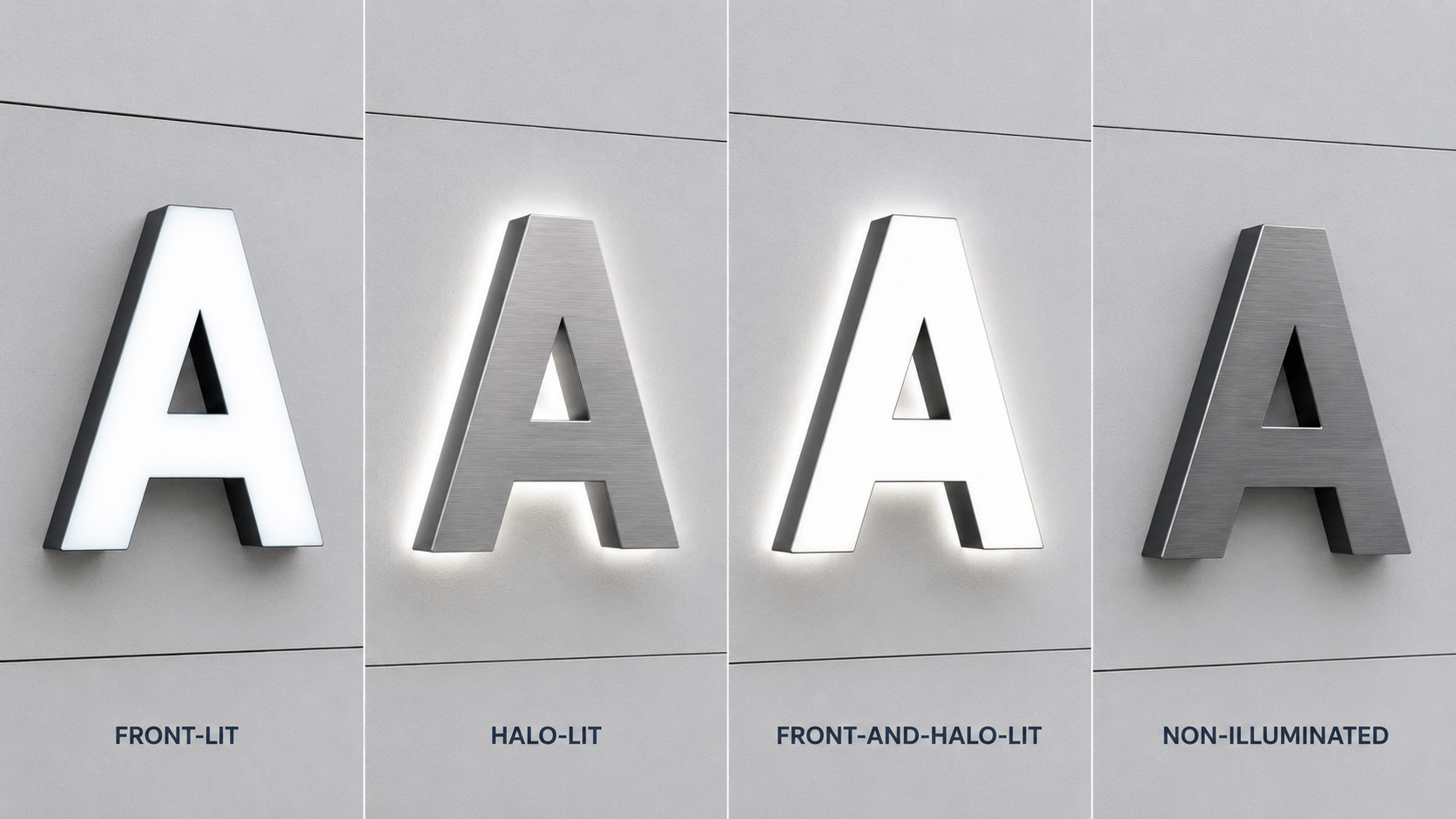
The four common types solve different visual problems. Their suitability also changes with the elevation behind them.
| Type | Where the light appears | Typical applications | Main condition to check |
| Front-lit | Through the face | Retail façades, restaurants, commercial buildings | Face diffusion, stroke width, and hotspot control |
| Halo-lit | On the wall behind the letter | Headquarters, hotels, offices, architectural branding | Façade reflectance, texture, and stand-off distance |
| Front-and-halo-lit | Through the face and onto the wall | Flagship locations and high-visibility elevations | Balance between front brightness and rear glow |
| Non-illuminated | No internal light | Reception areas, showrooms, daytime identification | Finish, depth, shadows, and ambient lighting |
Front-Lit Letters: Visibility Depends on Uniformity
Front-lit letters are read through a luminous face. They are often chosen where the sign must remain clear against a busy commercial background.
The difficult characters are rarely the largest ones. Narrow strokes, tight corners, small counters, and compact logo details leave less room for light to mix. If module spacing is copied across every character, one letter may appear smooth while another shows bright points or dark edges.
A practical review therefore looks at representative character shapes, not only the overall sign dimensions. Prototype testing is particularly useful when the typeface contains very narrow or irregular forms.
For a more detailed look at fabrication, see Custom Front-Lit Channel Letters Fabrication.
Halo-Lit Letters: The Wall Becomes Part of the Optical System
Halo-lit letters have an opaque front and project light backwards. The viewer reads the solid letter together with the glow appearing on the façade.
That glow is not created by the letter alone.
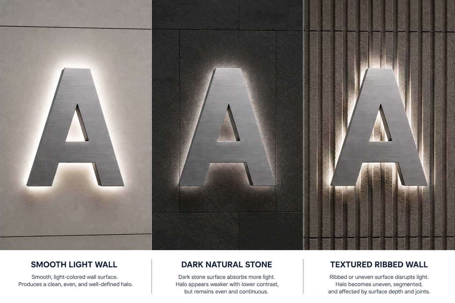
A pale, smooth surface generally reflects light more evenly than dark stone, deep joints, ribbed metal, or heavily textured render. Increasing LED output may brighten the source, but it cannot make an irregular wall behave like a uniform reflector.
The stand-off distance also changes the result. A small gap tends to produce a tighter edge, while a larger gap spreads the light further and can soften its intensity.
The right distance is therefore both a visual and structural decision—not simply a decorative spacer selected after fabrication.
For more background, see What Are Back-Lit Letters and How Do They Work?
Front-and-Halo Lighting: Two Effects Must Share One Hierarchy
Dual-lit letters can provide strong frontal visibility and an architectural glow. They also introduce a balancing problem.
If the face is much brighter than the rear light, the halo may disappear to the eye. If the rear effect is too broad or intense, the letterform can lose definition.
Face material, LED output, internal separation, wall finish, and viewing position need to be considered as one system.
For projects considering this configuration, see Benefits of Front and Halo-Lit Channel Letter Signs.
Non-Illuminated Letters: Simpler Does Not Mean Unconsidered
Non-illuminated letters remove LEDs, drivers, and internal wiring. That reduces electrical maintenance, but the finished sign still depends on return depth, edge quality, surface finish, fixing positions, and the shadows created by ambient light.
They often suit interiors where dimensional form matters more than night-time visibility. They can also be the more rational choice where existing façade lighting already provides sufficient identification.
Start With Viewing Conditions, Not a Catalogue Sample
A small sample can demonstrate colour and finish. It cannot show how a sign will read from a moving vehicle, across a forecourt, or from the base of a tall elevation.
Before letter construction is approved, the project team should establish:
- main approach directions;
- expected viewing distances and angles;
- installation height;
- day and night background conditions;
- competing light sources;
- the smallest strokes and internal spaces in the artwork.
Letter height alone does not determine legibility.
Stroke width, spacing, contrast, logo complexity, and the time available to read all matter. A sign viewed slowly from a nearby pedestrian route permits different decisions from one seen briefly from a vehicle.
This also changes procurement. Pricing should be based on approved artwork at final dimensions rather than only on a nominal height and a price per letter.
Material Selection Is a System Decision
There is no universal “best” channel letter material. The choice depends on exposure, weight, appearance, fabrication method, and repair strategy.
Aluminium
Aluminium is commonly used for returns and backs. It keeps weight manageable and can be cut, bent, joined, painted, or powder coated.
The coating system still needs to suit the exposure and detailing around edges, seams, and fixings.
Acrylic
Acrylic is frequently used for luminous faces.
Colour, thickness, translucency, and surface finish influence both daytime identity and night-time diffusion. The selected face should therefore be evaluated with the actual LED colour and cavity geometry.
Stainless Steel
Stainless steel is useful when the metal itself forms part of the design.
Brushed, polished, or coated finishes can support corporate and hospitality interiors as well as exterior architectural signs.
The grade and finish require project-specific review, particularly in humid, polluted, or coastal environments. Fixings and dissimilar-metal contact also deserve attention. Specifying stainless steel for the visible shell does not resolve every corrosion risk.
Resin and Digitally Fabricated Components
Resin casting and 3D printing can make complex curves, small forms, or reduced-seam construction more practical.
These processes are tools rather than automatic upgrades. Material stability, finish consistency, repairability, and production quantity should determine whether they offer a real advantage over conventional fabrication.
How Letter Depth and LED Layout Affect Light
Uniform light depends on optical distance.
LEDs need enough space for separate beams to overlap before they reach the face. When the cavity is too shallow for the selected modules and face, hotspots become more likely.
Making every letter deeper is not a complete answer. Extra depth adds material, projection, and sometimes weight. It may also conflict with the architectural intent.
A better approach is to coordinate:
Return depth + LED output + module spacing + internal reflectance + face diffusion
LED placement should follow character geometry.
Wide strokes may accept regular rows, while narrow or curved sections require a different arrangement. Corners and small enclosed spaces often need special attention because light can either concentrate or fall away.
Engineering Note: Review illumination at the expected viewing brightness and distance. A workshop photograph with an overexposed camera can conceal uneven light that remains visible on site.
Mounting and Electrical Planning Begin Before Fabrication
Channel letters may be fixed individually with studs, attached to a raceway, installed on a backer panel, or integrated into a larger support structure.
The preferred option depends on the façade, access rules, cable routes, waterproofing strategy, structural loads, and the visual tolerance for visible support elements.
Individual mounting can preserve a clean architectural appearance. It may also require more penetrations, more precise setting-out, and greater coordination behind the façade.
A raceway can simplify wiring and reduce site connections, but it introduces a visible element that must be accepted by the design team.
This is a genuine trade-off:
The cleanest front elevation may create the most demanding work behind it.
Power supplies need suitable ventilation, environmental protection, and safe access for replacement.
Hiding them inside a sealed or inaccessible architectural zone may provide a small aesthetic gain at handover while creating a much larger service problem later.
For international projects, local requirements for structural loading, wind conditions, electrical work, fire performance, waterproofing, permits, and signage regulations must be confirmed by the responsible project professionals.
An international signage manufacturer can develop fabrication and mounting details, but site approval remains location-specific.
Common Failure Modes and What They Reveal
Visible Hotspots
Symptom: Bright points appear through the face.
Likely causes: Insufficient optical depth, unsuitable face diffusion, excessive module output, or uneven LED spacing.
Prevention: Test the actual face, depth, and module arrangement together before volume production.
Dark Areas or Inconsistent Characters
Symptom: Edges, corners, or individual letters appear weaker.
Likely causes: One standard LED pattern has been applied to different geometries, or internal wiring affects output.
Prevention: Review layouts by character family and test the completed sign electrically.
Weak or Broken Halo
Symptom: The rear glow looks patchy or disappears in sections.
Likely causes: Dark or textured façade, inconsistent stand-off distance, obstructions, or poor rear LED distribution.
Prevention: Assess the actual wall surface and prototype a representative letter against a comparable background.
Water-Related Faults
Symptom: Intermittent lighting, staining, corrosion, or premature component failure.
Likely causes: Unsuitable drainage, sealing, cable entry, penetrations, or component protection for the exposure.
Prevention: Coordinate drainage and weather detailing with the façade rather than treating the letter as an isolated sealed box.
Difficult Maintenance
Symptom: A minor driver or LED repair requires façade removal, specialist access equipment, or extended closure.
Likely causes: Service access was considered after appearance and installation.
Prevention: Agree access panels, removable faces or backs, driver locations, and working clearances during design development.
What Manufacturing and Quality Control Should Verify
A typical production route moves from approved drawings through cutting, forming, joining, surface finishing, LED assembly, wiring, testing, packing, and delivery.
Complex logos may add machining, resin work, printing, or additive manufacturing.
The most advanced process is not necessarily the most suitable. Repeatable dimensions, stable finishes, controlled light output, and installable assemblies matter more than manufacturing novelty.
Inspection should cover at least:
- finished dimensions against approved shop drawings;
- artwork, spacing, and mounting templates;
- colour and surface-finish consistency;
- seams, edges, corners, and visible fasteners;
- face fit and serviceability;
- LED colour and uniformity across different characters;
- wiring, polarity, connectors, and driver compatibility;
- mounting points and cable exits;
- drainage or weather detailing where required;
- identification, packing sequence, and surface protection.
For multi-location programmes, labelling and packing are part of engineering control.
A well-made letter delivered to the wrong elevation—or packed in an installation-hostile sequence—still creates site risk.
How Should Channel Letters Be Priced and Procured?
Price varies with character size, stroke complexity, return depth, quantity, material, finish, illumination, electrical components, mounting, testing, packing, transport, and installation conditions.
This makes price-per-letter comparisons unreliable unless the constructions are genuinely equivalent.
Two quotations can use the same overall dimensions while allowing different metal thicknesses, LED layouts, driver locations, finishes, fixing systems, or service access.
A useful request for quotation should define:
Final artwork and dimensions + material construction + finish and colour + lighting effect + electrical requirements + mounting concept + façade information + quantity + testing + packing + installation scope + warranty and service expectations
Where details remain unresolved, ask suppliers to state their assumptions.
Hidden assumptions are often where later variations begin.
For a more detailed discussion of pricing, see Channel Letter Cost and RFQ Guide.
Channel Letters Are One Part of the Signage System
Building identification cannot carry every information task.
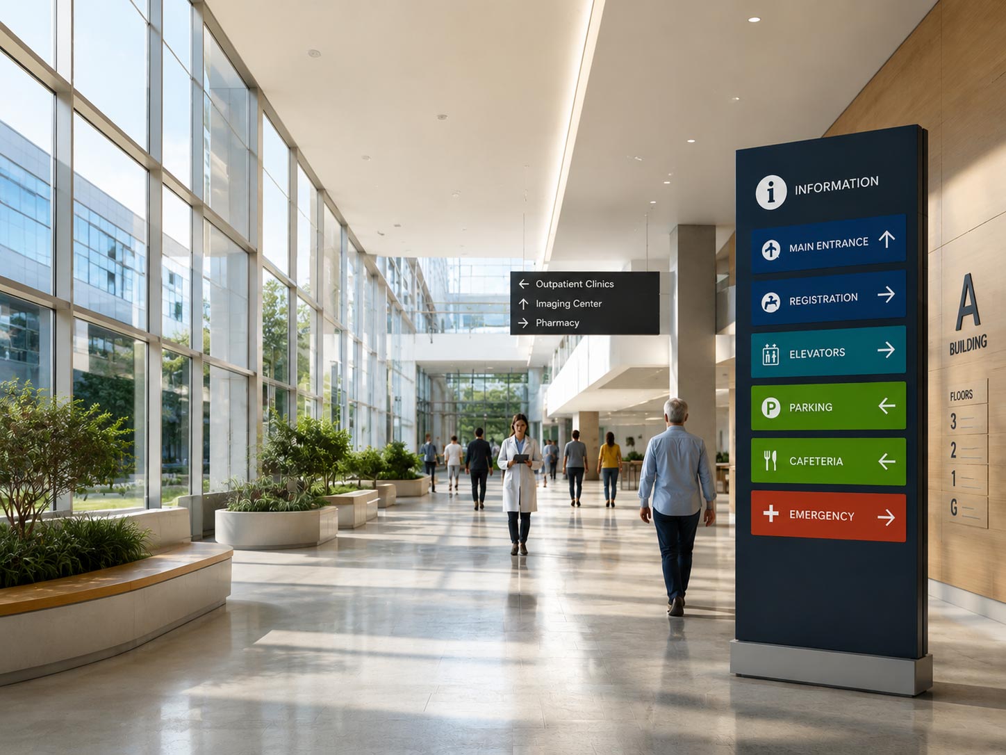
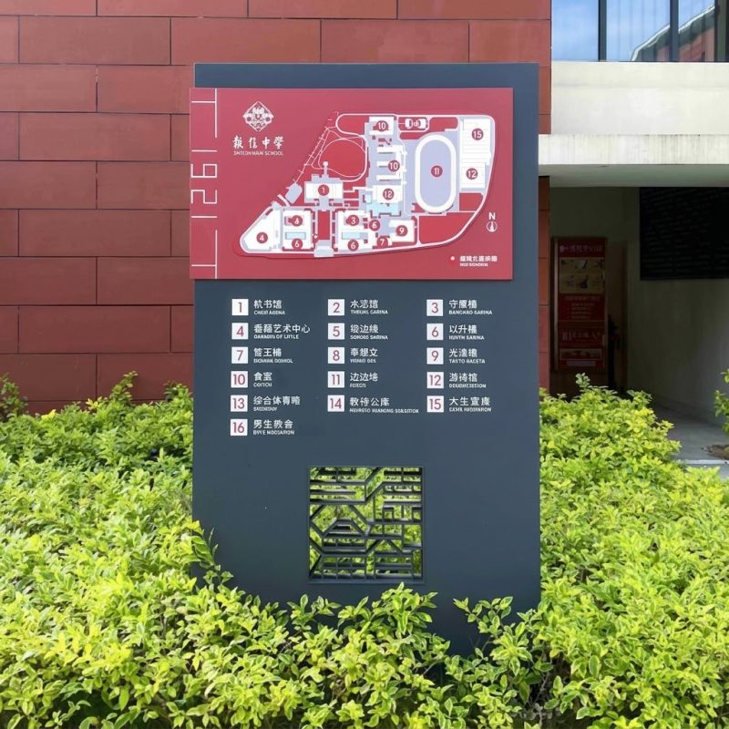
A headquarters may combine façade letters with an entrance monument, vehicular directions, pedestrian wayfinding, parking identification, and reception signage.
A commercial centre may use channel letters for tenant branding while directories and directional signs manage circulation.
The lettering should therefore share a visual and technical language with the broader system.
Colour, metal finish, proportions, illumination, and mounting details need coordination, even when different sign families use different constructions.
This prevents a common design split: a carefully resolved logo on the elevation followed by unrelated wayfinding at ground level.
A Better Way to Specify Channel Letters
A good channel letter specification does not begin with a catalogue model.
It begins with the conditions around the sign:
Who needs to read it?
From where?
Against what background?
Under what lighting conditions?
How will it be fabricated and fixed?
And who will need to service it later?
Once those questions are answered, the product specification becomes much clearer.
The design team can establish the appropriate letter type, material, depth, illumination, mounting method, and finish. The manufacturer can then translate those requirements into shop drawings, prototypes, production details, and quality-control procedures.
For larger architectural signage projects, this sequence reduces the risk of solving a visual problem in the workshop that should have been resolved on the building.
Frequently Asked Questions
What is the difference between a channel letter and a dimensional letter?
A channel letter has a formed body or “channel” that creates depth and can house illumination. Dimensional letters may be solid, fabricated, cut, cast, or built up, and do not necessarily contain lighting.
In everyday signage language the terms sometimes overlap, so drawings should describe the exact construction rather than rely on the product name.
Are front-lit or halo-lit letters better for a dark façade?
Front-lit letters usually retain clearer luminous contrast because light faces the viewer. A halo can become weak or uneven on dark, absorbent, or heavily textured materials.
Halo lighting may still work, but the wall finish, stand-off distance, LED layout, and ambient conditions should be tested before the effect is approved.
Why do channel letters show LED dots?
Visible dots usually indicate that LED output, spacing, face diffusion, and cavity depth are not working together.
The solution may involve changing module spacing or output, increasing optical distance, selecting another face material, or adjusting the internal surface. Adding more LEDs without testing can make the pattern brighter rather than smoother.
Should channel letters be mounted individually or on a raceway?
Individual mounting usually gives a cleaner elevation but can require more penetrations, accurate setting-out, and complex concealed wiring.
A raceway can simplify electrical assembly and site installation, although it remains visible.
The substrate, landlord rules, installation access, service strategy, and architectural intent should determine the method.
What information is needed for an accurate quotation?
Provide final artwork, dimensions, quantities, installation height, façade information, material and finish requirements, lighting effect, electrical conditions, mounting expectations, site location, packing needs, and installation scope.
Where the design is not final, request clearly stated assumptions and options instead of comparing unexplained lump sums.
Conclusion
Channel letters appear simple because most of their engineering is hidden.
The LEDs sit behind the face. The fixings disappear into the wall. The power system is kept out of view. Yet those concealed decisions determine whether the sign reads evenly, installs cleanly, withstands its environment, and remains practical to maintain.
For architects, contractors, and procurement teams, the useful question is therefore not simply:
“Which type of channel letter do we want?”
It is:
“Which construction fits this façade, this viewing condition, and this service plan?”
That shift—from choosing a product to specifying a complete system—is what makes channel lettering more predictable from design development through fabrication and installation.
COSUN SIGN approaches custom channel letter projects from the same perspective, coordinating design development, fabrication, illumination, quality control, packing, and international project requirements as parts of one signage process.


 粤公网安备44030702001648号